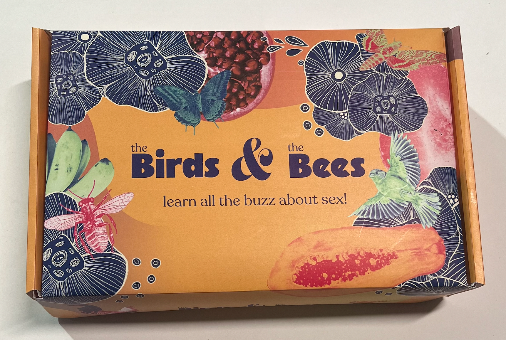
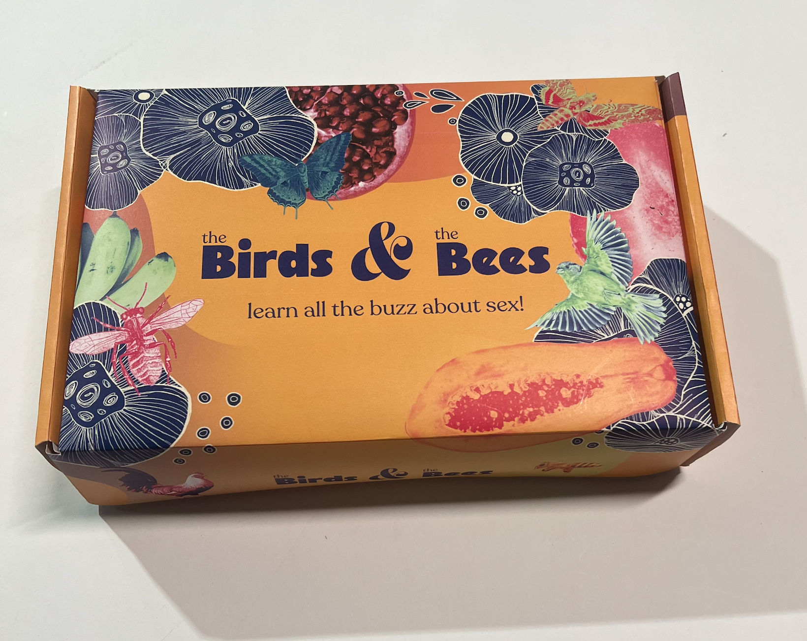
In this project, our team partnered with a local non-profit to craft practical materials that contribute to their community initiatives. We examined the intersection of design and service, immersing ourselves in the non-profit's work during a visit to better understand its community impact. The client presented us with a compelling real-world design challenge – developing a sex-ed bingo kit aimed at assisting parents in educating their children about sex while fostering open discussions on safe practices. This innovative product is intended for distribution to organizations and online sales to support fundraising efforts. The comprehensive kit will feature three distinct bingo card designs, facilitator cue cards, instructions, a solution for marking spaces, and a thoughtfully designed container or box for a complete and impactful experience.
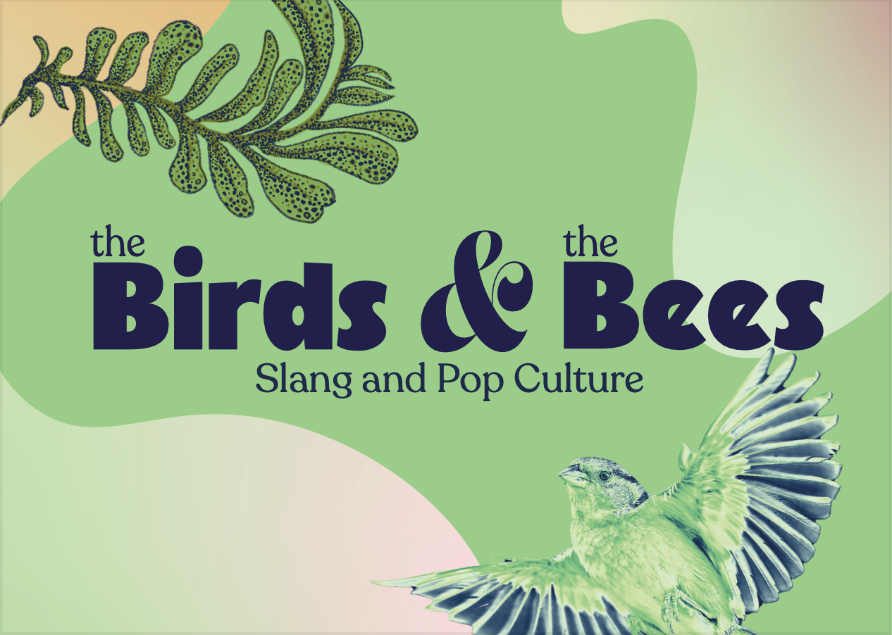
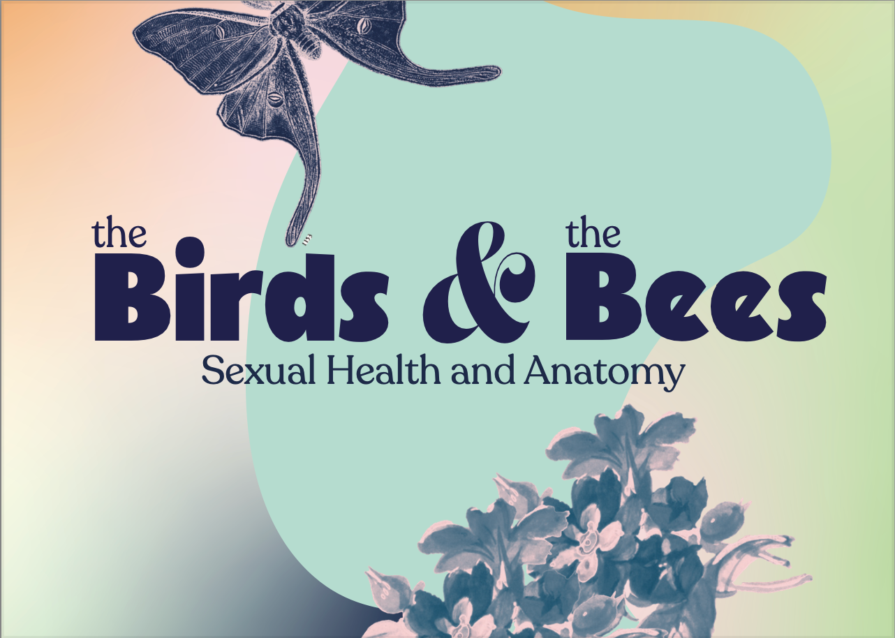
Logo Design:
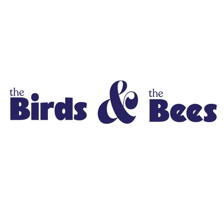
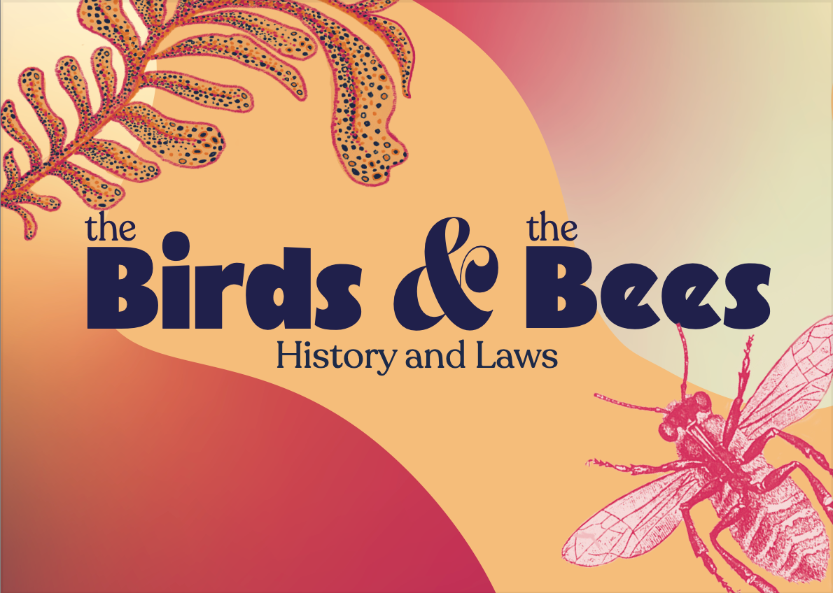
The logo design aims for a bold and attention-grabbing impact. The name "The Birds and the Bees" was inspired by a previous design team. The chosen typeface is deliberately clear, simple, and playful to enhance the overall design aesthetic.

Art and Graphics:
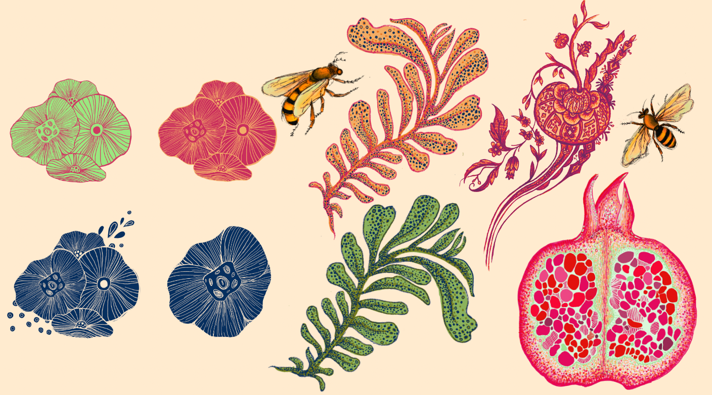
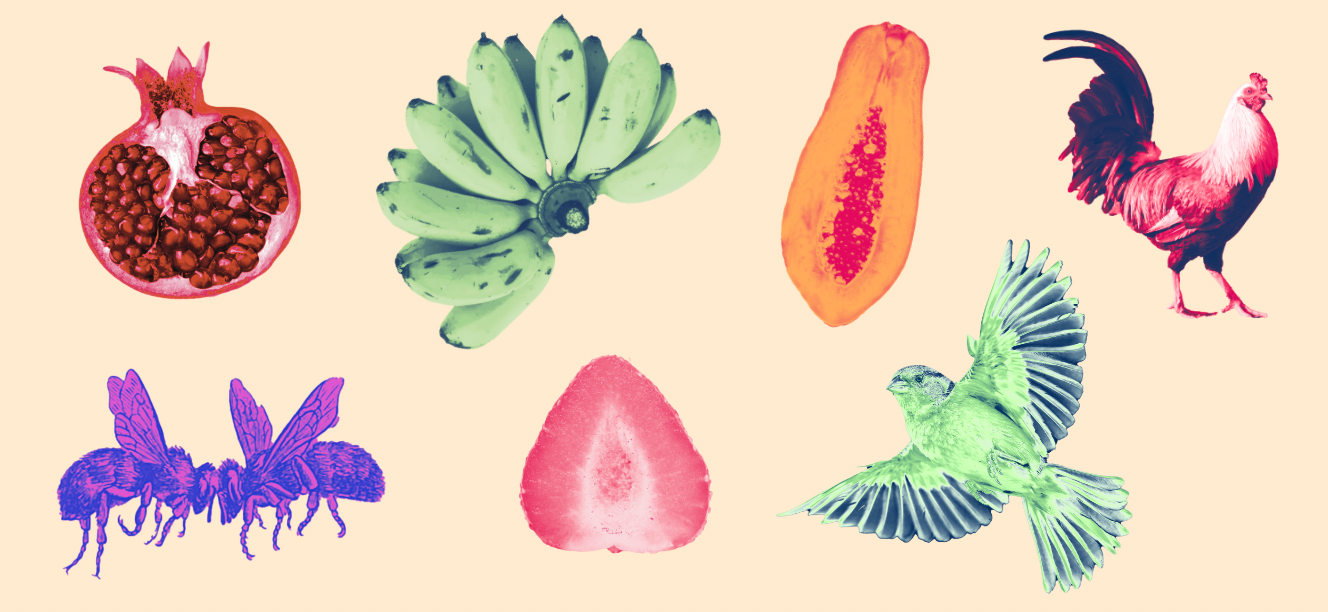
The art and graphics seamlessly blend hand-drawn elements with digital components. The intentional use of vibrant colors is aimed at enhancing the visual appeal and making the designs truly stand out. Various graphics underwent transformation; some were adapted from books using Adobe software, while others sourced from the internet underwent modifications through techniques such as saturation adjustments and color masking.


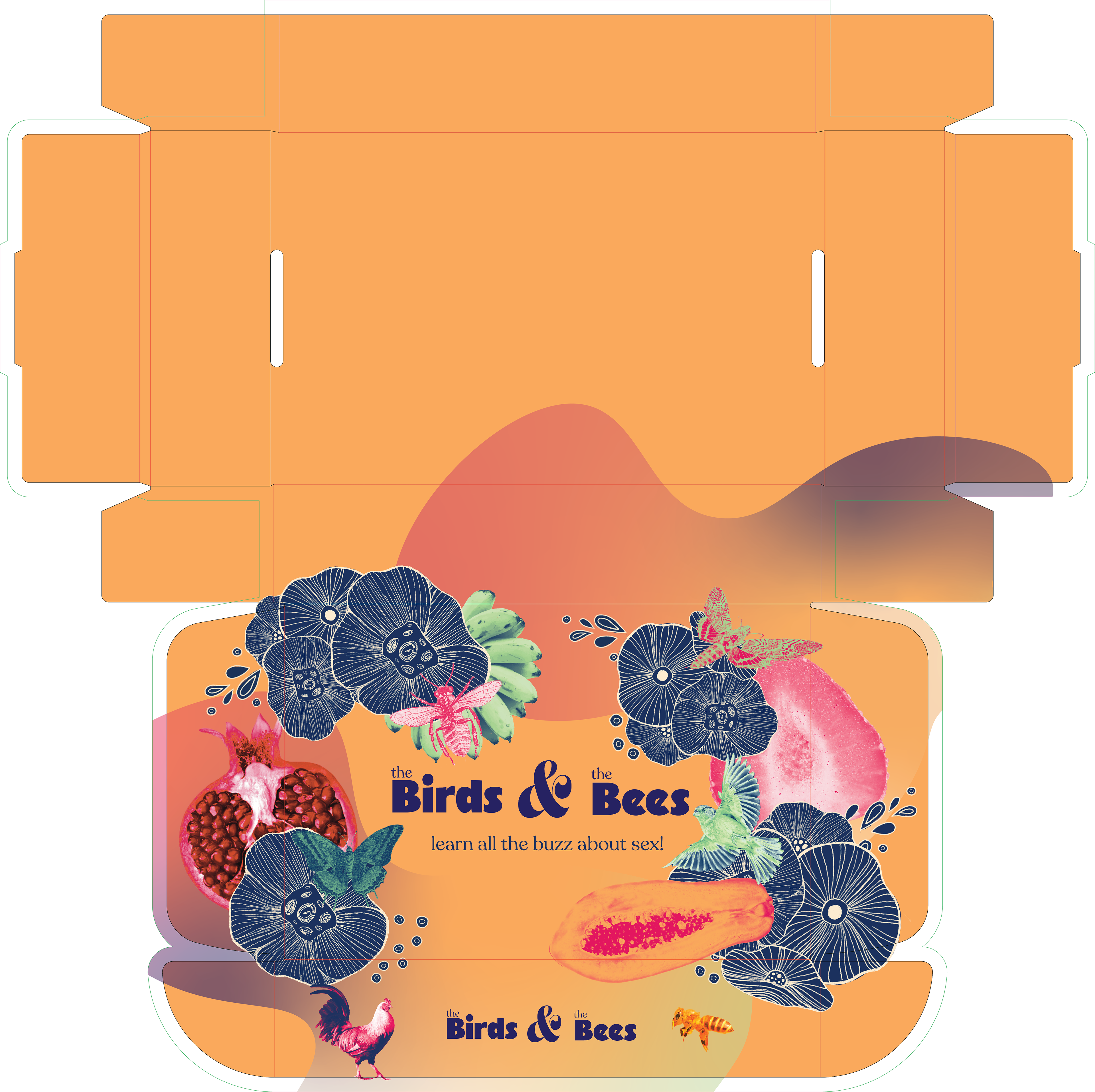
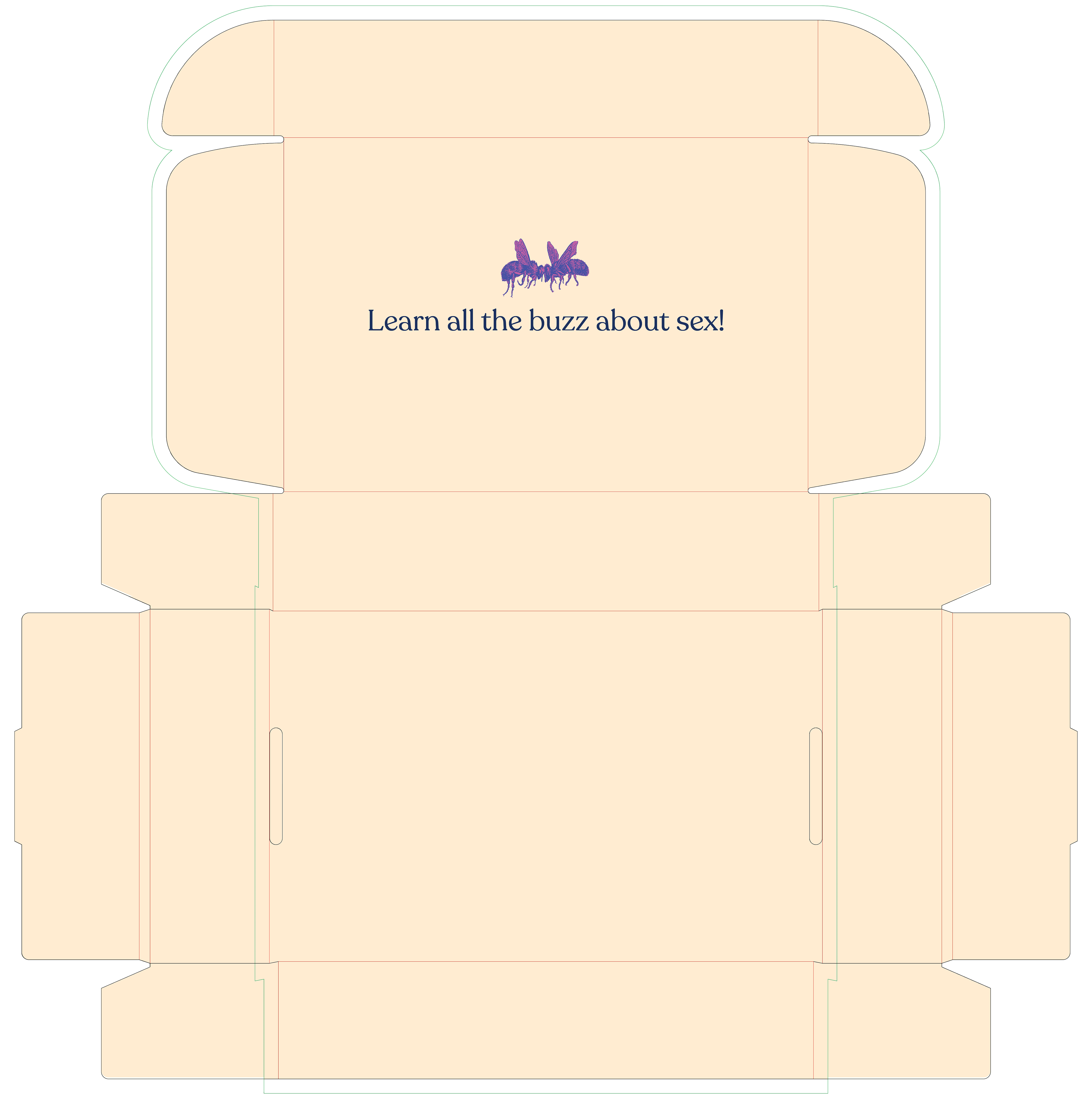
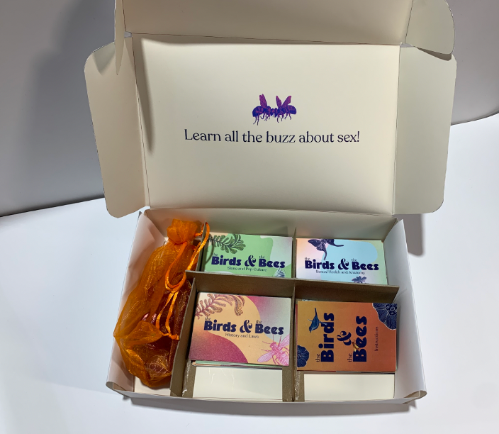
Box Design:
The design choices were crafted with the specific intention of capturing the attention of both children and adults. Our team strategically opted for a vibrant color palette, ensuring that the design elements would stand out and command visual interest.
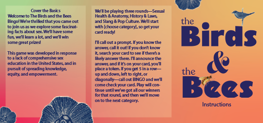
Instruction pamphlet:
The instructional pamphlet serves as a guide to acquaint players with the game's mechanics. Its design not only provides clear instructions but also introduces the background story behind the game's invention. Within the pamphlet, you'll find a comprehensive set of information, including instructions, the game's logo, its origin narrative, rules, and details about the company.

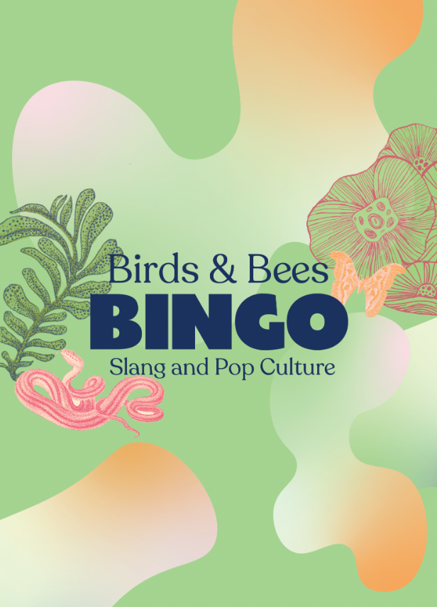
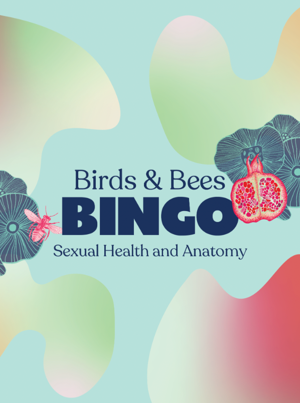
Bingo Cards:
Our team aimed to create distinct designs, ensuring the cards maintained cohesion without causing confusion. To achieve this, we opted for diverse colors for each card, yet tied them together with similar design elements. Emphasizing clarity, we made a conscious decision to minimize the use of graphics, prioritizing the content of the bingo cards as the main focus.


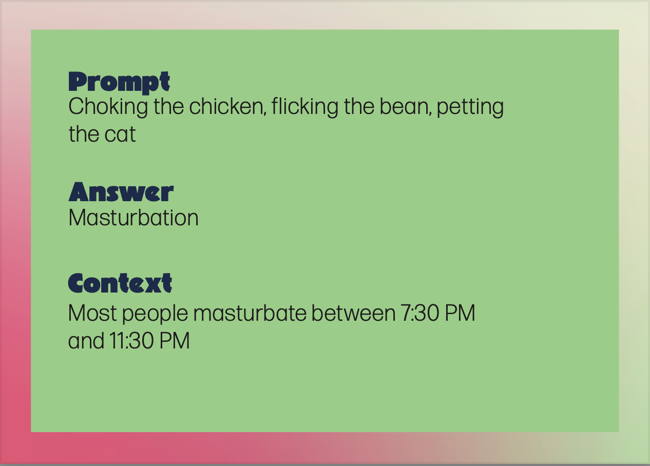
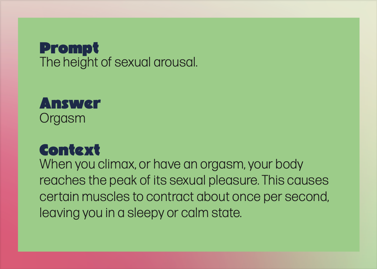
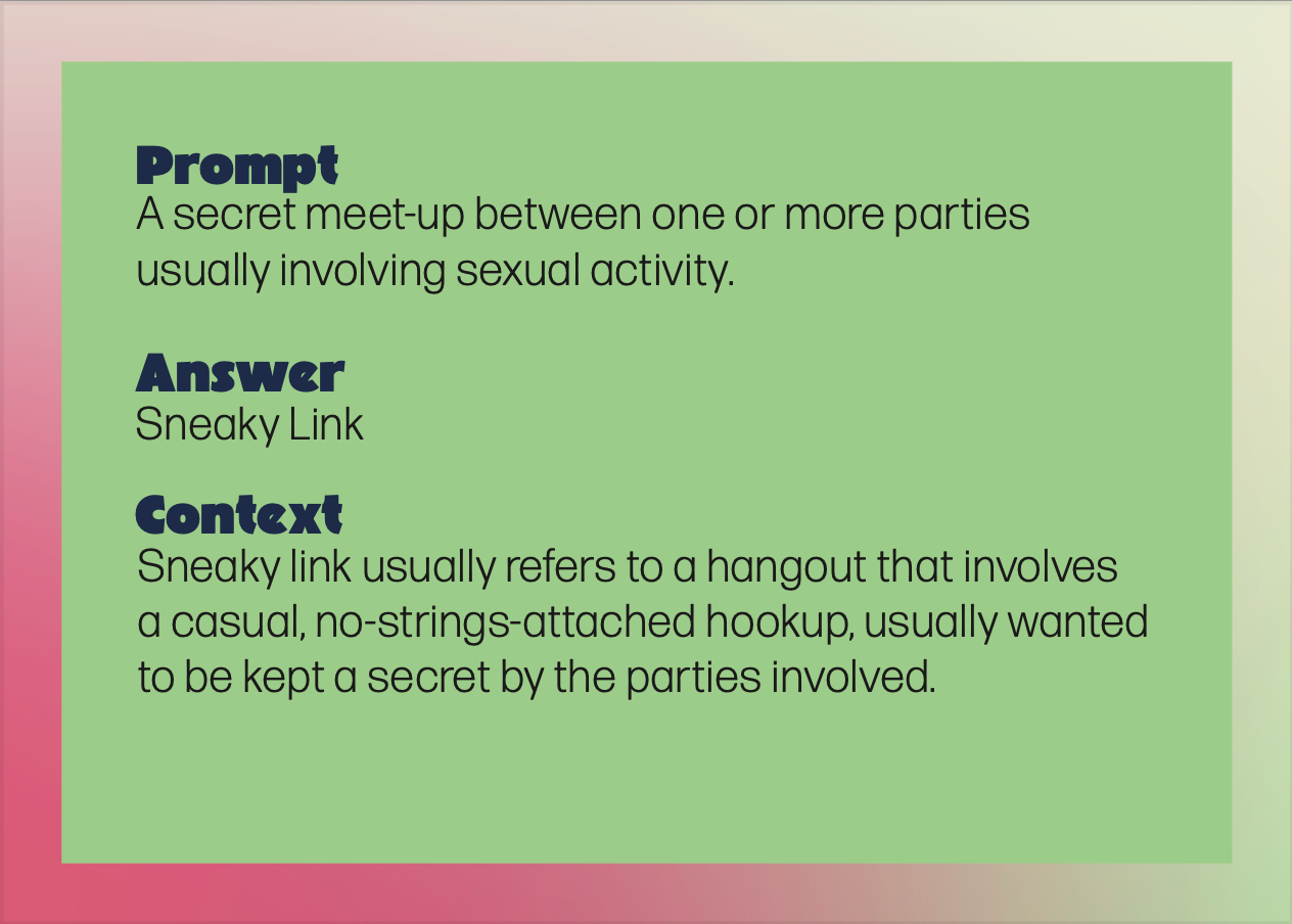
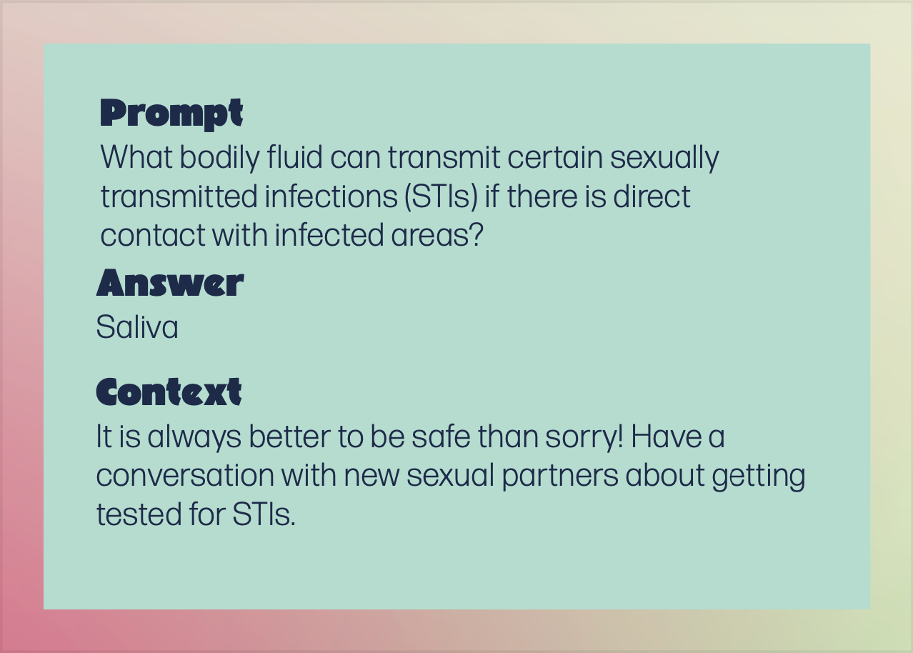
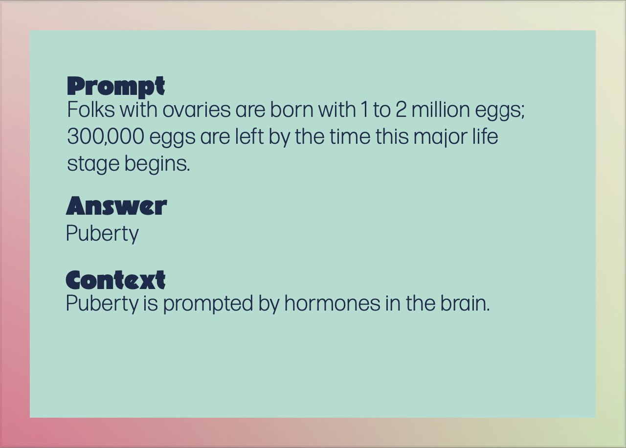
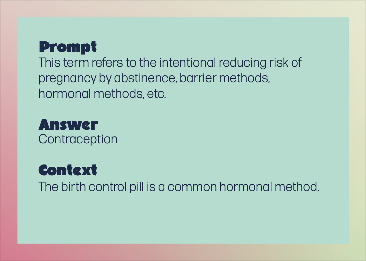
Facilitator Cards:
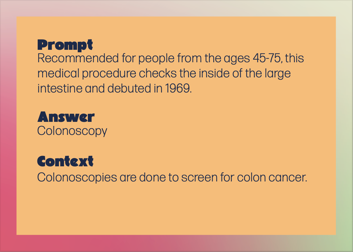
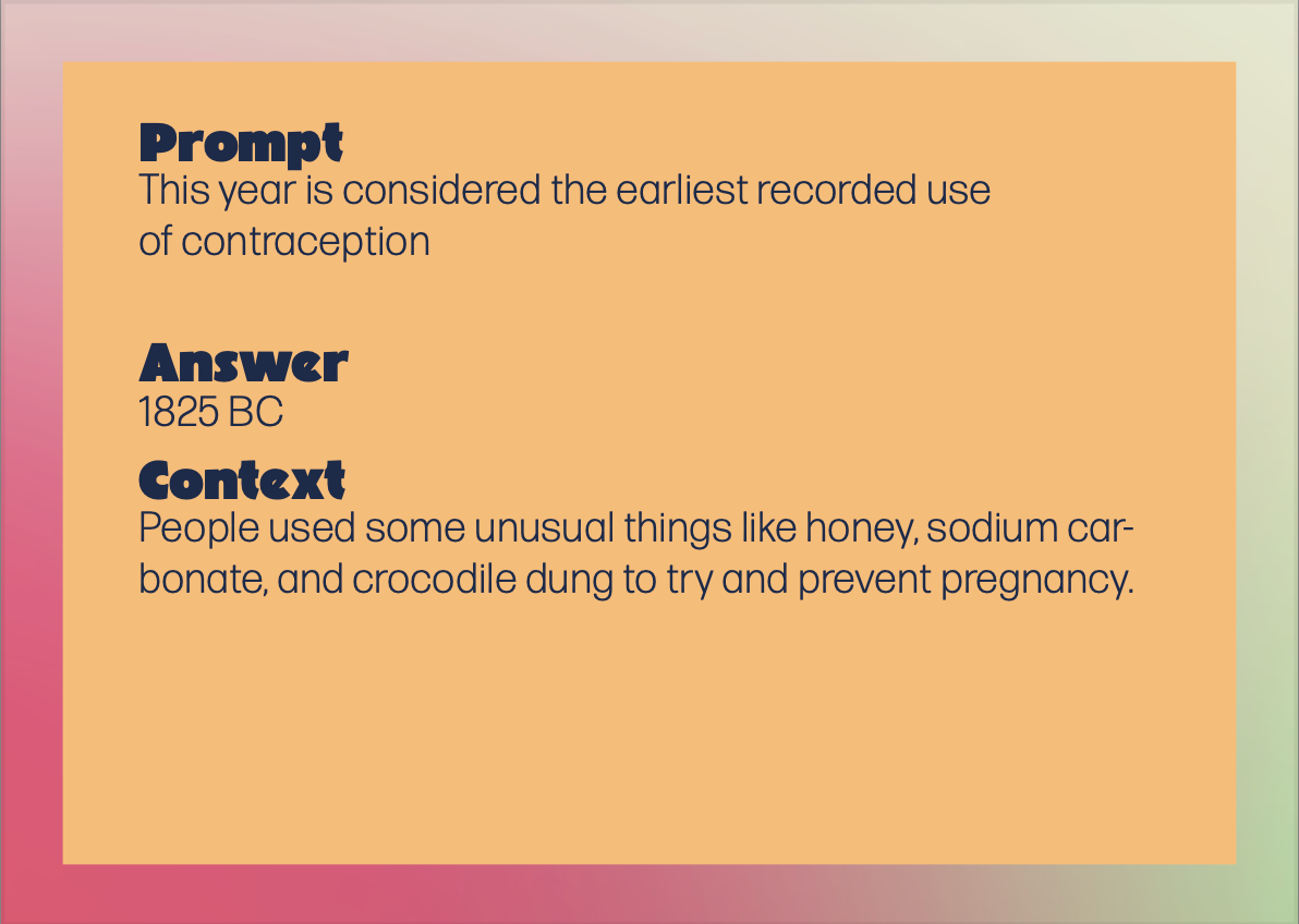
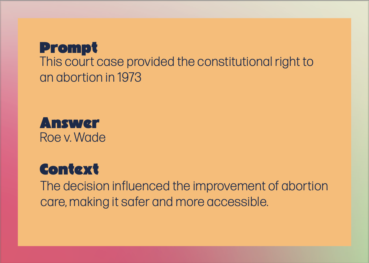
By employing identical colors and design elements from the bingo cards, our team effectively emphasized the correlation between each set of facilitator cards and their corresponding bingo cards. Each facilitator card comprises a prompt, answer, and supplementary information. This additional information not only provides background context for the prompt but also creates a window for further discussion on the topic, enriching the overall engagement experience.


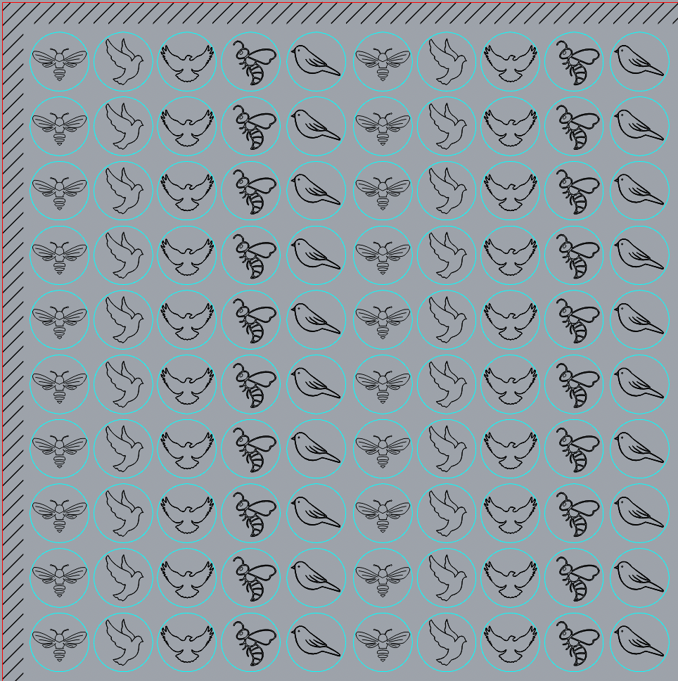
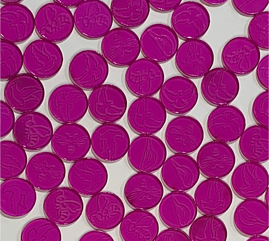
Token Design:
After thoughtful deliberation, our team opted for tokens that permit the prompts to remain visible when placed on the bingo cards. The selection of pink bingo chips was purposeful, harmonizing with the box's color scheme. Through the use of a laser cutter, we intricately engraved a design that seamlessly ties together the overall theme, ensuring cohesion throughout the entire product.
Final Product

Collaborators:
Pascale Beauregard, Sami Stone, Ellia Giuliani, Emma Campisi, Claire O'Sullivan, Cambria McKee, Sophia Lammers, Sophia Badame, Shelby Sanders, Sarah Isaac, Ellie Bowles, Lynn Mary Hammel, Shyla Krishnappa, Alex O'Leary, Jamie Plissner, Mia Fleischer, Peter Miller, and Kelly Davis